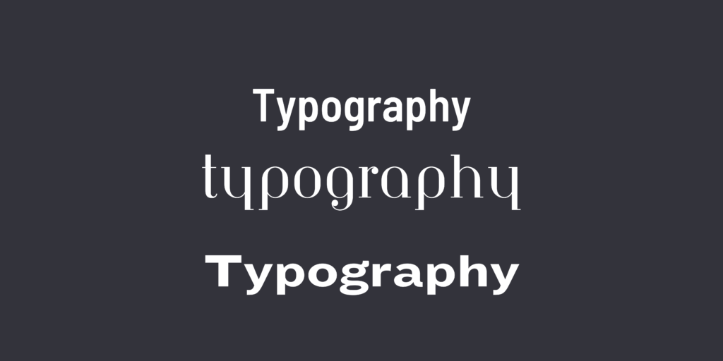
Typography is crucial for entrepreneurs starting their own business as it directly influences brand perception. The choice of fonts and styles communicates the brand’s personality, establishing a visual identity that resonates with the target audience. Effective typography enhances communication, builds brand recognition, and contributes to a professional and cohesive image, ultimately influencing customer trust and engagement. This guide should provide you with key information around how to get started in your typography journey as a beginner.

1. What is Typography?
At the core of written communication lies the art of typography. But what is typography, exactly? It’s the skillful arrangement of letters and text to ensure that the copy is not only legible but also visually appealing. Typography involves considerations of font style, appearance, and structure, all aimed at eliciting specific emotions and conveying precise messages.
1.1 A Brief History of Typography
To understand typography in 2024, we must delve into its origins. Dating back to the 11th century and the innovation of movable type, typography was initially a specialized craft associated with books and magazines. The Gutenberg Bible marked a revolutionary moment, introducing a style known as Textura, still present in today’s font options.
2. Why is Typography Important?
Typography is not just about choosing beautiful fonts; it’s a vital component of user interface design. Let’s explore why typography holds such significance.

2.1 Typography Builds Brand Recognition
Good typography enhances a website’s personality and fosters a subconscious association between the typeface and the brand. Consistent and unique typography helps establish a strong user following and builds trust.
2.2 Typography Influences Decision-Making
The choice of typography significantly impacts how users digest and perceive information. Eye-catching type reinforces the message, making it more persuasive than weaker fonts.
2.3 Typography Holds the Attention of Readers
In the digital age, good typography can be the difference between a brief visit and an extended stay on a website. It contributes to visual stimulation, making the content more memorable.
3. The Different Elements of Typography
Embarking on the journey into typography involves understanding its essential design elements.
3.1 Fonts and Typefaces
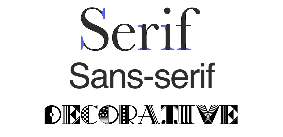
Distinguishing between typefaces and fonts is crucial. A typeface encompasses a design style, while a font is a graphical representation of a text character. Serif, sans-serif, and decorative are the three basic types of typefaces.

3.2 Contrast
Like hierarchy, contrast helps convey emphasized ideas or messages. Playing with typefaces, colors, styles, and sizes creates impact and makes text interesting and attention-grabbing.
3.3 Consistency
Maintaining consistency in typefaces is key to preventing a confusing interface. Establishing a consistent hierarchy of typefaces and sticking to it ensures readability and a coherent design.
3.4 White Space
Often overlooked, white space, or negative space, contributes to an uncluttered interface and enhances text readability. Properly utilized white space draws attention to the text and provides an aesthetically pleasing experience.
3.5 Alignment
Alignment unifies text, graphics, and images to ensure equal space, size, and distance between each element. Adhering to industry standards, such as left-to-right alignment for readability, is crucial.
3.6 Color
Color adds excitement to typography, allowing designers to be creative. Balancing value, hue, and saturation ensures legibility and visual appeal.
3.7 Hierarchy
Establishing typographical hierarchy distinguishes between prominent and standard text. Size, color, contrast, and alignment contribute to effective hierarchy.
4. Choosing the Right Typeface for Your Website

Picking the right typeface involves considerations beyond aesthetics.
4.1 Think About Personality
Consider how you want users to feel when entering your website. Typography should reflect the personality of the brand or product.
4.2 Reflect on Tone
Harmonize the font with the tone of the message. Serious information may require a less stylized, more legible font.
4.3 Don’t Skimp on Function
Function is as vital as form. Legibility, readability, and accessibility should guide typeface choices.
4.4 Consider Performance
Choose web browser-friendly typefaces for seamless rendering. Opt for web-based font files, such as those offered by Google Fonts.
4.5 Get Inspired
Explore existing typography patterns for inspiration. Social media and design platforms can offer valuable insights.
4.6 Take Time to Test
Testing different typefaces with real users provides valuable feedback on legibility and user experience.
5. Key Takeaways
Typography, often overlooked, is a critical component of user interface design. Understanding its elements and mastering its principles contribute to becoming an exceptional UI designer. Explore and analyze typography in your favorite websites to gain insights into effective typeface choices.
If you are looking to develop a typography for your business, then feel free to contact the Frostbolt team here.
For more insights into UI design, check out related blog posts:
