Explore the world of fonts and typography with this comprehensive list of terms and their definitions.
A
Accents: See Diacritics.
Alternates: Varied shapes or glyphs for the same character in a typeface, including small caps, swash characters, contextual alternates, and case-sensitive forms.
Anti-aliasing: Softening the edges of a font on-screen to enhance the appearance of bitmapped type, typically desirable at large point sizes.
Antiqua: German and Scandinavian term for serif faces, as opposed to “Grotesk,” meaning sans-serif faces.
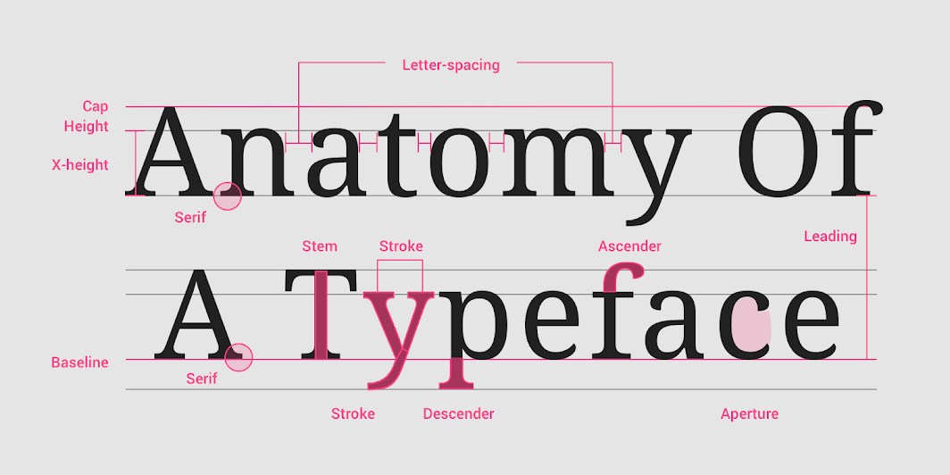
Aperture: Partially enclosed, rounded negative space in certain characters, such as ‘n,’ ‘C,’ ‘S,’ ‘e,’ or a double-storey ‘a.’
Apex: The point at the top where two strokes meet, as in the capital ‘A.’
Arc: Any curved contour of a letter.
Arm: The horizontal stroke in a character that does not connect to a stem on one or both sides.
Ascender: Any part in a lowercase letter that extends above the x-height, found in letters like ‘b,’ ‘d,’ ‘f,’ ‘h,’ ‘k,’ etc.
Axis: An imaginary line bisecting the upper and lower strokes of a glyph from top to bottom, helping determine type classification.
B
Backslant: Characters leaning to the left, contrasting with italic or slanted characters leaning right.
Ball Terminal: A terminal resolving into a circular shape.
Bar: The horizontal stroke in characters like ‘A,’ ‘H,’ ‘R,’ ‘e,’ and ‘f.’
Baseline: The imaginary line upon which letters in a font appear to rest.
Beak: A triangular, serif-like protrusion at the end of a stroke in certain serif type designs.
Body: The imaginary area that encompasses each character in a font; its height equals the point size, and its width is the letterform plus sidebearings.
Bowl: The curved part of a character enclosing circular or curved parts, as in ‘d,’ ‘b,’ ‘o,’ ‘D,’ and ‘B.’
Bracket: A curved or wedge-like connection between the stem and serif of some fonts.
C
Cap Height: The height from the baseline to the top of uppercase letters.
Case Sensitive: Punctuation marks centered on the x-height of lowercase letters; fonts with case-sensitive punctuation have raised alternates centered on the cap height.
Character: Any letter, numeral, punctuation mark, or other sign included in a font.
Contextual: Feature-rich OpenType fonts that can substitute certain characters or combinations before/after specific characters based on context.
Counter: Enclosed or partially enclosed circular or curved negative space of some letters, like ‘d,’ ‘o,’ and ‘s.’
Crossbar: The usually horizontal stroke across the middle of uppercase ‘A’ and ‘H.’
Cross Stroke: The usually horizontal stroke intersecting the stem of lowercase ‘f’ and ‘t.’
Crotch: The inside of a narrow angle where two strokes meet, as in ‘V,’ ‘W,’ ‘Y.’
D
Delta Hinting: Instructions added to a TrueType font for consistent on-screen display at any size.
Descender: Any part in a lowercase letter extending below the baseline, found in ‘g,’ ‘j,’ ‘p,’ ‘q,’ ‘y,’ etc.
Diacritics: Marks added to letters, including accents; they alter the sound value of letters in the Latin alphabet.
Dingbats: Decorative symbols and characters not typically included in a font, like boxes, bullets, arrows, etc.
Display: Typefaces designed for decorative or headline use, intended for larger settings.
Double-storey: ‘a’ or ‘g’ with two counters, in contrast to single-storey variants with one counter.
E
Ear: Typically found on the lowercase ‘g,’ an ear is a finishing stroke, usually on the upper right side of the bowl.
Embedding: Including font information in a digital document to ensure correct rendering.
EOT (Embeddable OpenType): File format for linking TrueType and OpenType fonts to web pages.
EULA (End User License Agreement): Agreement defining terms and provisions for font software use.
Expert Set: A font with special characters like small caps, fractions, ligatures, extra accents, and alternate glyphs.
Eye: Similar to a counter, it refers specifically to the enclosed space in a lowercase ‘e.’
F
Family: A collection of related typefaces sharing common design traits and a name.
Feature-rich: OpenType fonts with advanced typographic features.
Fett: German name for the black weight in a type family; bold weight is called “halbfett.”
Figures: Arabic numerals used in typography with the Latin alphabet, including lining and old-style figures.
Finial: The curved or tapered end of a stroke without a serif.
Fixed-width: See Monospaced.
Flag: The horizontal stroke at the top of the numeral ‘5.’
Flourish: Ornamental strokes, often based on calligraphic writing, attached to letters or characters.
Font: A collection of letters, numbers, punctuation, and symbols used to set text.
Foot: The part of a stem that rests on the baseline.
Foundry: A company designing and/or distributing typefaces.
G
Gadzook: An embellishment connecting letters in a ligature but not part of either letter.
Glyph: Every character in a typeface represented by a single design; alternates are usually referred to as glyphs.
Grotesk: German name for sans-serif faces, contrasting with “Antiqua” for serif faces.
H
Hairline: The thinnest stroke in a typeface with varying stroke widths.
Halbfett: German name for the bold weight in a type family; black weight is called “fett.”
Hanging Figures: See Oldstyle Figures.
Hinting: Guidelines added to a font for consistent printing and display at small sizes.
Hook: The curved, protruding stroke in the terminal of lowercase ‘f,’ ‘J,’ and ‘j.’
Hybrid Figures: An intermediary style between oldstyle figures and lining figures.
I
Ink Trap: Opening sharp interior corners to avoid ink build-up.
Inline: Describing a typeface with white lines appearing inside character strokes, imitating carving or chiseling.
Italic: A slanted type style, often narrower than its roman counterpart, primarily used for emphasis.
J
Joint: The spot where a stroke joins a stem.
K
Kerning: Adjusting space between specific letter pairs to correct spacing issues.
L
Leading: Vertical space between lines of text, from baseline to baseline.
Leg: The downward-sloping stroke on the letters ‘K,’ ‘k,’ and ‘R.’
Ligature: Special characters combining two letters into one, enhancing visual flow.
Linespacing: Vertical space between lines of text, measured from baseline to baseline.
Lining Figures (LF): Numbers resting on the baseline, usually the height of capital letters.
Link: The small, curved connecting stroke between the upper bowl and lower loop in the double-storey ‘g.’
M
Majuscule: An uppercase or capital letter.
Mark: A diacritic added to a letter.
Measure: The width of a column of text, usually measured in picas or ems.
Medium: The weight between regular and bold.
Minuscule: A lowercase letter.
Monoline: A typeface with consistent stroke weight.
Monospaced: Characters with equal horizontal spacing, often used for code or tabular data.
Movable Type: Printing method using individual metal or wooden pieces for each character.
N
Nipple: The small, pointed stroke extending from the arm in some serif type designs.
Non-Lining Figures: See Oldstyle Figures.
Nudge: A minor adjustment to the placement of a character.
O
Oblique: Similar to italic but without the true cursive angle.
Oldstyle Figures (OSF): Numbers varying in height, with some ascending or descending like lowercase letters.
OpenType (OTF): A font format allowing advanced typographic features.
Ornament: Decorative design elements added to characters.
Overhang: The part of a character that extends beyond its usual width, as seen in a cursive ‘f.’
P
Panose: A system for classifying typefaces based on visual characteristics.
Pantograph: An adjustable tool for scaling or duplicating type.
Point Size: The height of a font’s characters, measured in points.
Proportional: Characters with varying horizontal spacing.
Pronounced Bracket: A bracket with a more noticeable curvature.
Pronounced Serif: A serif with a noticeable stroke weight.
Pronounced Stress: A noticeable variation in stroke thickness.
Pronounced Terminal: A terminal with a noticeable ending stroke.
Q
Quaint: See Oldstyle Figures.
Quadrata: See Oldstyle Figures.
Quirk: The finish or ending stroke in the arm of a letter, typically seen in lowercase ‘r.’
Quotation Marks: Used to enclose quoted text, available in single and double forms.
R
Radical: The root part of a Han character.
Reeding: Parallel grooves on the surface of a type body.
Regular: The standard weight in a type family.
Reproduction Proof: A proof used for checking the accuracy of reproduction.
Right-aligned: Text aligned along the right margin.
Roman: The standard upright form of a typeface.
S
Sans-serif: A typeface without serifs.
Script: Typefaces imitating handwriting.
Serif: A small line attached to the end of a stroke in a letter.
Shank: The main vertical stem of a letter, excluding any ascenders or descenders.
Shoulder: The curved stroke connecting a stem to a serif.
Small Caps: Capital letters designed at the x-height of lowercase characters.
Spine: The main curved stroke in the letter ‘S.’
Square Serif: A serif with a squared-off end.
Stem: The main vertical or diagonal stroke of a letter, excluding any ascenders or descenders.
Stroke: The main lines of a letter, such as the vertical stroke in ‘I’ or diagonal stroke in ‘A.’
Superior Figures: Numbers raised above the baseline, often used for footnotes.
Swash: Elaborate, decorative letterforms with exaggerated flourishes.
Swiss Style: A sans-serif typeface characterized by clean lines and minimal ornamentation.
T
Terminal: The end of a stroke that doesn’t include a serif.
Text Figures: See Oldstyle Figures.
Thick-and-Thin Stroke: A type design where strokes vary in thickness.
Thin Stroke: The lightest stroke in a typeface with varying stroke weights.
Tilde: A diacritic mark resembling a small wave.
Tracking: Adjusting space uniformly between all characters in a block of text.
TrueType (TTF): A font format developed by Apple and Microsoft.
U
Uppercase: See Majuscule.
Upstroke: The stroke moving from the baseline up, such as in the letter ‘n.’
Upright: The standard orientation of a typeface.
U&lc (Uppercase and lowercase): A type case containing both uppercase and lowercase letters.
V
VOC (Voice of the Customer): Customer feedback and preferences influencing type design.
W
Weight: The thickness of the strokes in a typeface.
X-height: The height of lowercase letters without ascenders or descenders.
Y
Y&lc (Ys and lowercase): A type case containing the letter ‘Y’ and lowercase letters.
Z
Zapf Dingbats: A set of 201 decorative symbols.
Zigzag: A pattern of sharp turns, as seen in the terminal of some letters.
Explore the art and science of typography with this glossary, offering insights into the intricate details of type design. From the basic anatomy of letters to advanced font features, this guide provides a comprehensive resource for anyone interested in the world of fonts.